
Creating a Responsive Web Framework for
Simon Fraser University.
Responsive Revolution
In our increasingly mobile model of information consumption, the university recognized that the ability to display SFU.ca effectively on a myriad of devices has become a necessity. We wanted to provide our students and faculty with uninterrupted access to university information regardless of where or what device they're on. Using the university backed Adobe CQ (Experience Manager) content management as our platform, the team IT Services set out to create a new common look and feel and a responsive SFU.ca
Timeline
January - December 2013
A new common look and feel and introduction to a responsive framework

What I did
I created many of the foundational responsive behaviours for the components that are built on Adobe Experience Manager (known as CQ5 before). Prior to this position, I had no experience in front-end web development. By the end of my time at SFU, I was fluent in HTML5, CSS3, and got a hang of JS.
Together with our developers, we designed, created, styled, and device-tested all the components that content authors would use. We wrote instructions and documented each component for our end users and also hosted training sessions for both new and current content authors that wanted to learn more about responsive web design.
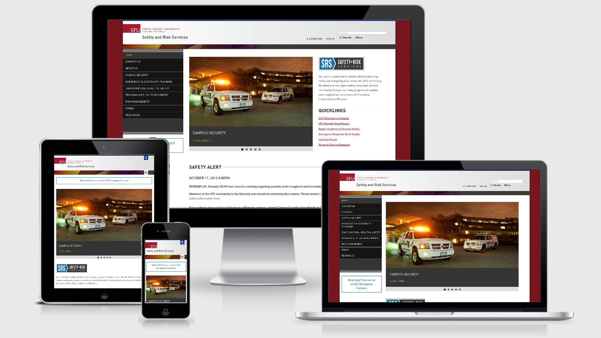
Internal Client Work
I also had the opportunity to work with many internal clients to rebuild their faculty and departmental sites with the new common look and feel. My tasks ranged anywhere from doing quick 3 day conversions to a full site re-design. Some of the notable clients I worked with include the AQ Magazine, Faculty of Science, and Safety and Risk Services.


Challenges and Successes
Rolling out a new common look and feel while introducing the concept of a responsive web was a particularly challenging task. We needed to ensure that the new common look and feel can, for the most part, support the current needs of the content authors while also making the transition into responsive layout a relatively easy process. We successfully redesigned and converted over 5 faculty sites by our launch day. Many more faculties and departments were converted in the coming months with our help and we continue to provide training to support our content authors.